
Branding that works, not just looks good.
Designed to work in business, not just in presentations. It should sell, structure communication, and support growth.
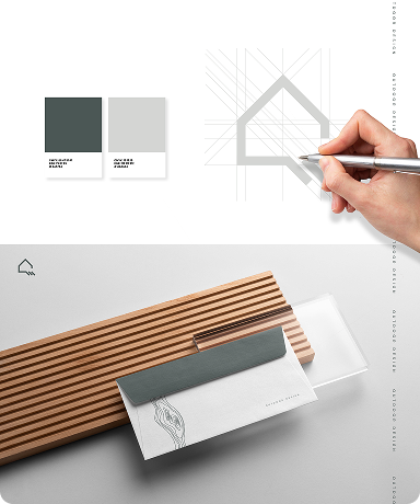
Visual identity
We design a cohesive system of logo, typography, and colors that structures the brand’s visual presence and simplifies everyday design decisions. As a result, materials, website, and communication are created faster and without improvisation.
design the logo and its variants: primary, alternative layouts, symbol, mono versions
select and design typography for everyday use
define a color palette and clear rules for applying it
create core visual elements that support the system
establish practical usage rules so the identity works in real-life applications
Everything is built around how the brand will actually be used.
You’ll receive:
a complete visual identity ready for implementation,
a system that can grow without losing consistency,
materials your team, designers, and external partners can confidently use.
As a result, your brand looks consistent, recognizable, and professional.
when you’re building a brand from scratch
when your current visuals don’t match the quality of your offer
when the brand has grown but lost visual consistency
when you’re planning a website, campaign or rebrand and need a solid base
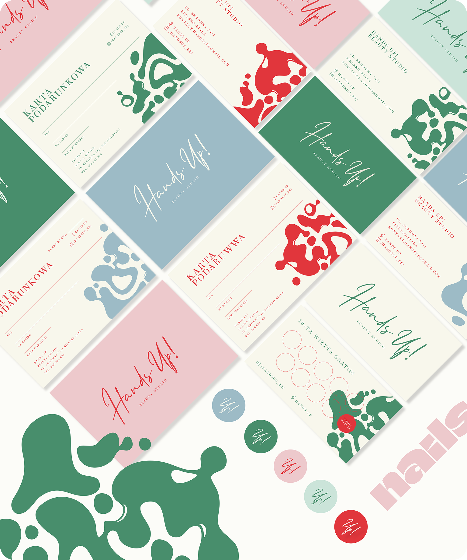
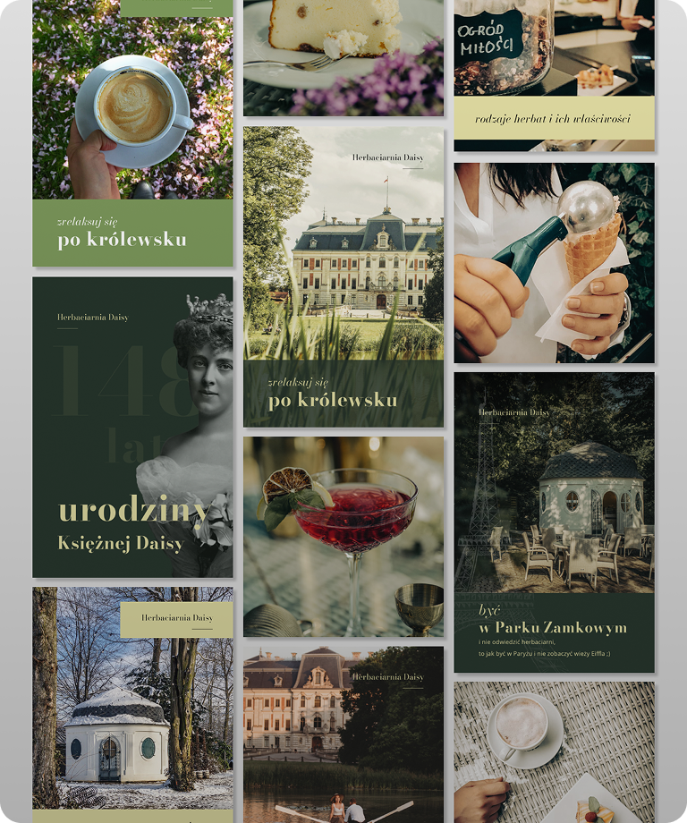
Example outcomes
Brand language
This is not a brand document, but a ready-to-implement communication system with content, posts, and templates included. We develop the language and materials that can be immediately used across social media, campaigns, websites, and sales.
Ready-to-publish posts - with final copy and prepared visuals,
Campaign materials - complete messages with formats tailored to specific channels,
Website content - headlines, offer sections and a clear communication structure,
Bios, service descriptions and short copy - ready to use in presentations and pitches,
Narrative frameworks - designed to scale your communication further.
These are solutions ready for implementation, so you can start using them immediately. Each one is created in the context of your brand and the needs of your potential audience.
We work with real communication situations from your brand, not abstract examples.
We analyze:
where and how your brand communicates today,
where it loses consistency or clarity,
which messages actually support customer decision-making.
Based on this, we design a language that:
is consistent yet flexible,
works across different channels,
can be easily reused by your team or partners.
You receive designed and ready-to-use posts and texts that you can immediately:
publish on social media,
use in campaigns,
implement on your website,
share with your team as a clear reference point.
Depending on the agreed scope, this may also include:
editable templates (e.g. Canva),
design components or layouts (e.g. Figma),
materials prepared for easy reuse and further rollout.
Everything is designed to be implemented, not interpreted.
Example outcomes
Ready to implement reels scenarios.
Posts rooted in the place and its history.
Engaging content for developers.
Brandbook
It comes into play when a brand no longer fits into a single logo. It’s a system that brings clarity to communication as the company grows. Instead of guesswork, it provides clear rules and practical examples, ensuring the brand stays consistent in real use, not just in presentations.
The brandbook is built from clearly defined elements that together form a coherent identity and communication system.
Inside, you’ll find:
a visual identity system: logo (variants), color palette, typography, visual style,
design principles: content hierarchy, layout, contrast, rhythm, correct and incorrect usage,
brand language: tone of voice, key messages, narrative rules,
brand storytelling: core communication themes and example content,
visual and verbal references: moodboards and reference points,
consistency rules: how all elements work together in practice.
The brandbook is a set of practical deliverables, not a conceptual document.
You receive:
a structured and clearly defined identity system,
real-use examples across key communication contexts,
designed materials such as:
decals and outdoor formats,
social media posts and content formats,
website elements and landing pages,
sales and offer materials,
team apparel and promotional materials,
a working document ready for team use: PDF or online version.
Everything is designed to be ready to implement, without interpretation.
This solution is designed for brands that:
operate across multiple communication channels,
work with teams, partners, or external vendors,
want to eliminate inconsistency and repeated reinvention,
need a single reference point for design and communication.
The outcome:
faster execution,
fewer wrong decisions,
consistency regardless of people or formats.
A brandbook for teams that want to work systematically, not manage communication manually.
Example outcomes
Rebranding and brand growth.
creative concept and delivery of outdoor campaign.
Comprehensive visual product launch.

Contact Form
Every good project starts with a first step, you know what to do.